PostNL
Streamlining B2B Onboarding: increasing conversion by 180% for PostNL business clients
I led the redesign of the PostNL business onboarding journey, transforming a complex 18-step process into a streamlined 10-step flow. By balancing "friction-based" vs. "low-friction" strategies and optimizing three key touchpoints, I achieved a conversion increase from 6% to 17% and a significant boost in Customer Effort Score (CES).

My role
Lead UX Designer
Team
Service designer, 1 data analyst, Developers, Business Stakeholders
Timeline
6 months, part-time
Delivery
2024
1. Overview
Context
PostNL’s onboarding process for new business customers was a critical bottleneck. Potential clients were dropping out in large numbers, leading to lost revenue and a perceived image of PostNL as an inaccessible partner. I was onboarded to lead the redesign after the initial problem had been identified and research had been conducted by service designers. My task was to translate these insights into a simplified journey and make PostNL a more approachable service provider.
The challenge
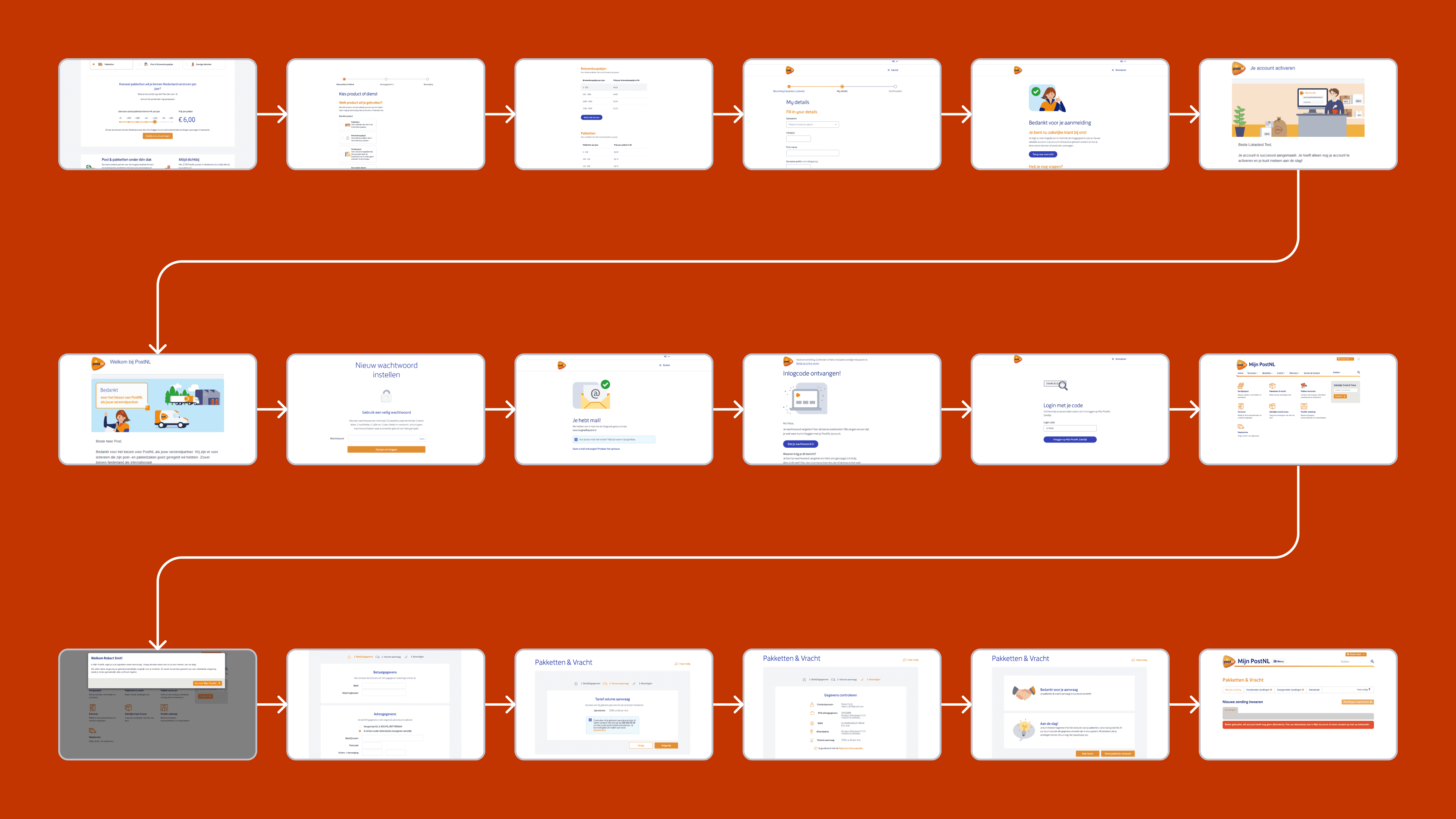
The "wall of steps": The original journey was 18 steps long with 37 clicks, resulting in a dismal 6% conversion rate.
High effort: The Customer Effort Score (CES) was a mediocre 4.4, indicating users found the process frustrating.
Complex touchpoints: The journey was fragmented across three major areas: product selection/sign-up, email activation, and portal landing.
The solution
I led a comprehensive redesign that broke the journey into three manageable clusters. By introducing a "low-friction" sign-up model, merging redundant communication, and creating a "warmer" landing experience in the portal, we slashed the journey from 18 to 10 steps and tripled the overall conversion rate.
2. Discovery & validation
Auditing insights & collaboration
I collaborated closely with the Service Designers, auditing their existing user journey maps to identify five concrete friction categories:
Process opacity: Users had no high-level view of the "Becoming a customer" process.
Product rigidity: Users could only pick one product at a time, despite our multi-service offering.
Pricing gaps: A lack of clear price indications left users feeling uncertain.
Premature IBAN requests: Forcing bank details early created a "payment anxiety" barrier.

Competitor analysis: logistics vs. saaS
I conducted a deep dive into onboarding patterns to define a new strategy:
Logistics standards: Competitors (DHL, FedEx) were heavily "compliance-first," prioritizing internal risk management over user momentum.
SaaS innovation: Industry leaders like Slack and Monday.com utilized "Product-Led Growth" tactics, deferring sensitive data requests until after an "Aha!" moment.
The opportunity: A clear gap existed for a logistics provider to offer a "Value-First" experience that felt more like a modern tech service than a traditional utility.

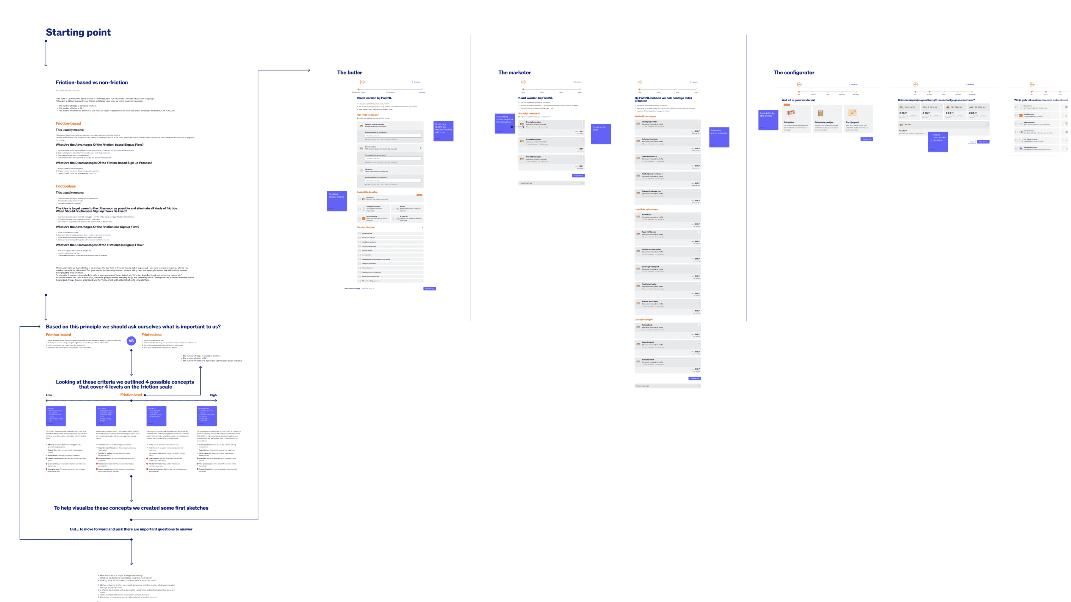
The friction scale: strategy over guesswork
To help stakeholders visualize the trade-offs, I introduced a Friction Scale Framework. I developed four distinct concepts and plotted them on this scale, facilitating a workshop where we weighed the pros and cons of high-volume sign-ups vs. higher quality, activated leads. The outcome of this session was a decisive pivot toward a "Low-Friction" strategy, aligning stakeholders on the goal of maximizing initial conversion by deferring high-effort compliance tasks until after the user had gained access to the platform.
3. The solution
I led the redesign through three distinct phases, focusing on removing friction and building trust through progressive disclosure.
Phase 1: Re-engineering the sign-up flow
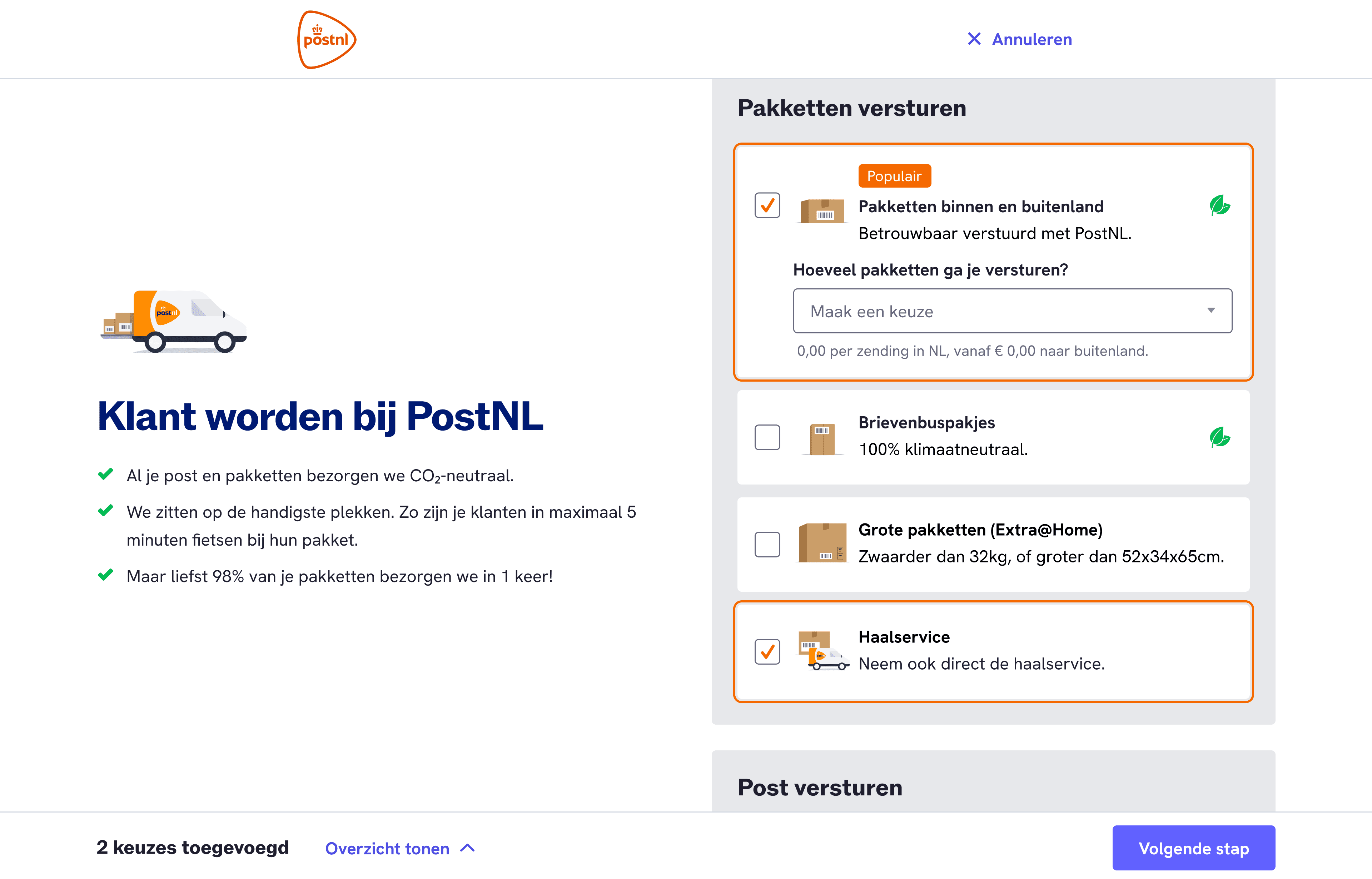
Following our strategic choice for a "low-friction" model, I addressed core pain points by moving toward a flexible experience:
Multi-select: I replaced the one-product limit with a multi-selection UI, enabling cross-selling from the first click.
Deferred verification: Moved the IBAN field to the portal, framing it as "setting up your payment preference" rather than a prerequisite to entry.
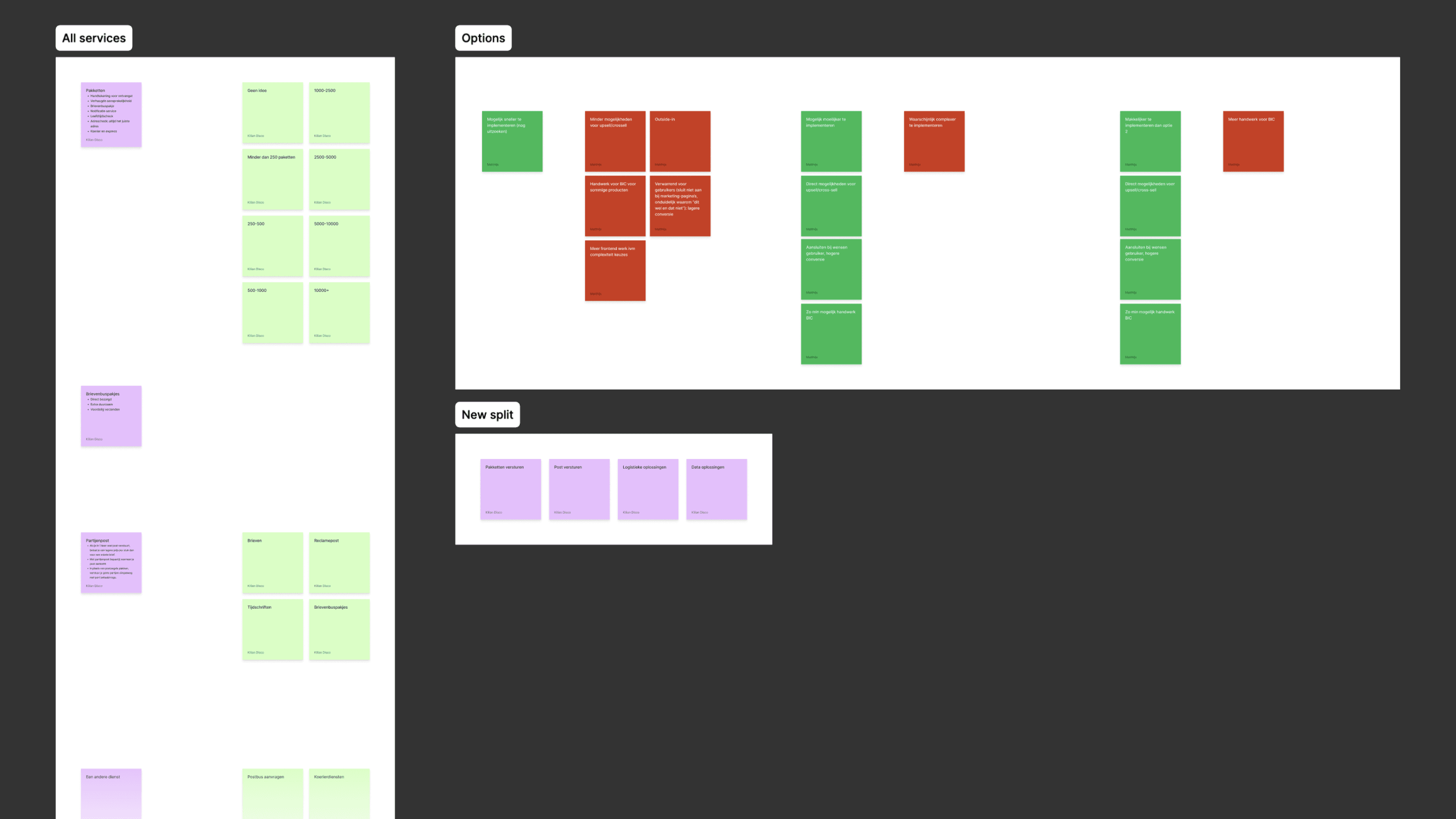
Usability testing & iteration: I validated prototypes with 5 diverse business owners. Based on feedback regarding choice paralysis, I opted for a tiered selection model: primary services were shown upfront to drive momentum, while secondary products were moved to a separate page.
Phase 2: consolidating the activation journey
We identified a significant "momentum leak" caused by fragmented post-signup communication. I led a cross-functional audit of our CRM touchpoints to bridge this gap:
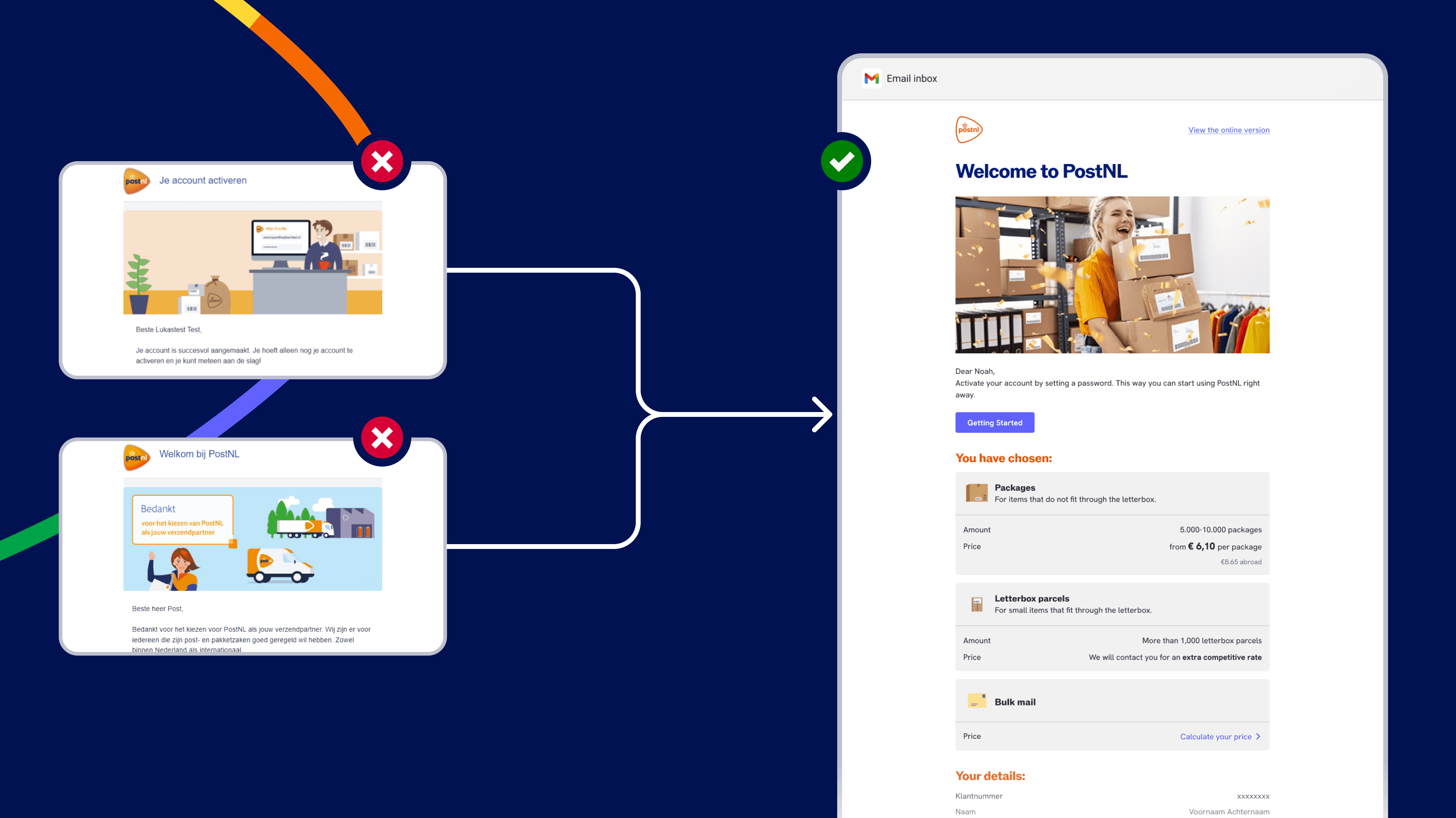
CRM audit: I mapped out every transactional email a user received. We discovered that sending a "Review" email and a separate "Activation" email created a technical silo that confused users.
The one-email fix: I worked with the Marketing and CRM teams to merge these into a single "Welcome & Activation" email.
Psychological continuity: I ensured the user's selected products were mirrored in the email’s visual layout. This provided immediate recognition and served as a personalized "Welcome" that significantly increased the click-through rate to the activation link.
Phase 3: The "warm landing" & guided setup
Landing in the portal was previously overwhelming; users were "officially" customers but lacked a clear path to their first shipment.
The onboarding checklist: Inspired by SaaS onboarding patterns, I designed a modular setup guide. I prioritized the final tasks based on the "minimum viable setup" required to print a label (IBAN, KvK Address, Method).
Non-invasive guidance: We designed a persistent but non-intrusive progress bar and setup alerts. This ensured that users who wanted to explore the portal could do so freely, while those ready to ship were nudged through the final three technical hurdles without feeling locked out of the dashboard.

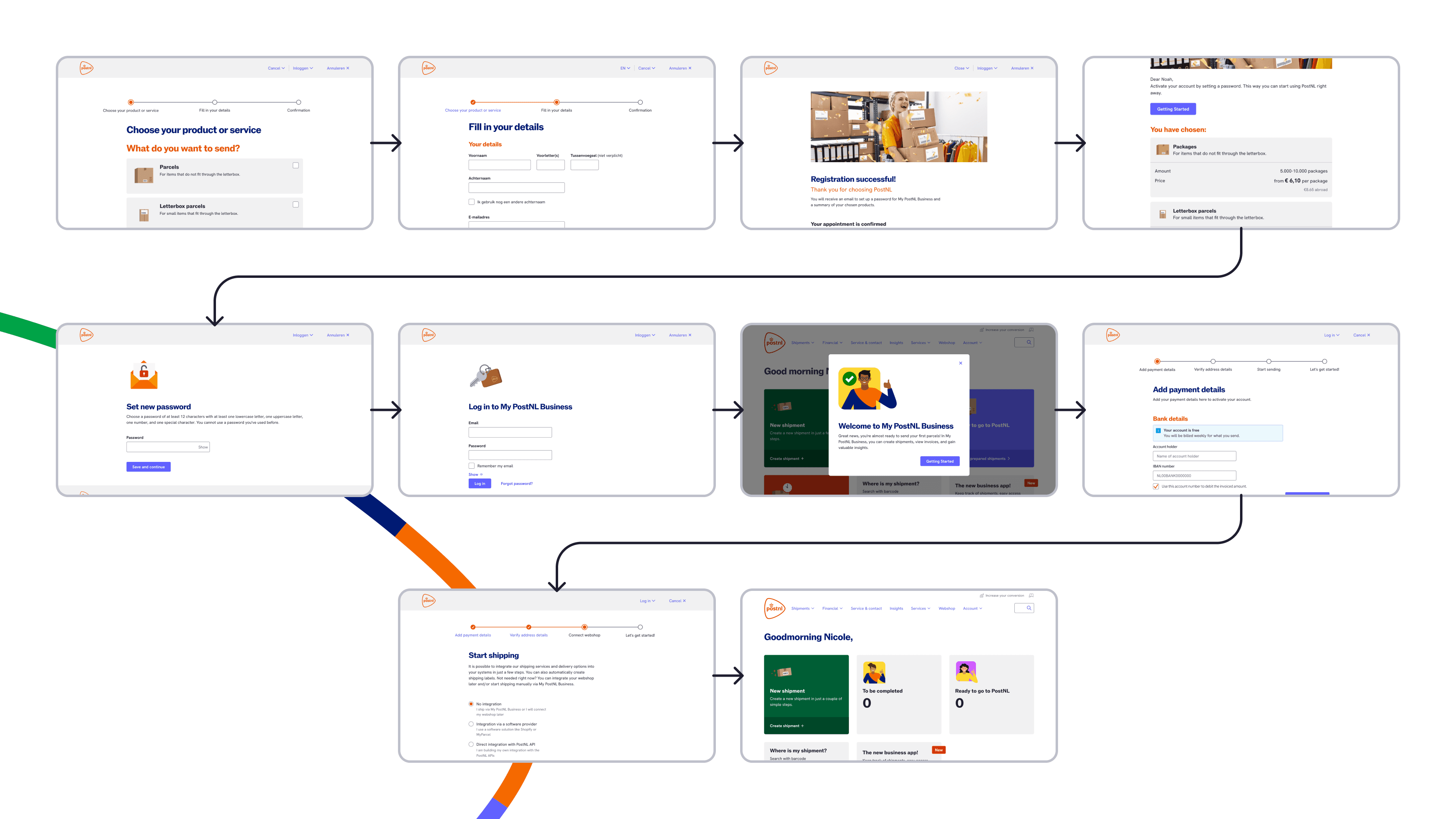
The result: the new 10-step journey
By merging technical silos and streamlining the UI, we transformed the fragmented journey into a linear, high-velocity flow:
Service selection: Multi-product bundle building.
Basic details: Minimalist account creation form.
Review & submit: Transparent summary of choices.
Single activation email: Combined confirmation and login link.
Soft portal landing: Personalized welcome dashboard.
Business verification: One-click KvK API confirmation.
Address verification: Confirmation of physical locations.
IBAN setup: Payment preference (Only pay for what you ship).
Method selection: Choose between Manual, File, or API.
First shipment: Completion of the "Aha!" moment
4. Impact
The redesign delivered a massive return on investment, significantly improving both business health and user satisfaction.
The Growth Story: From Friction to Conversion
Metric | Original Flow | New Flow | Improvement |
|---|---|---|---|
Conversion Rate | 6% | 17% | 180% Increase |
Customer Effort Score (CES) | 4.4 | 5.5 | +25% Effort Reduction |
Steps / Clicks | 18 / 37 | 10 / 17 | 45% Faster |
Cross-sell Adoption | 0% | 35% | New Revenue Stream |
Net Promoter Score (NPS) | -11 NPS | +4 NPS | Significantly Improved |
Strategic Impact
Revenue preservation: By tripling the conversion rate, we significantly reduced the amount of "lost revenue" from abandoned sign-ups.
Multi-product success: Introducing multi-product selection immediately drove a 35% cross-sell rate, proving that users wanted to buy more than we were letting them.
Letterbox parcel success: For the specific "Letterbox" segment, conversion skyrocketed from 2.8% to 14%.
5. Reflection
Lessons learned
Friction as a tool: This project taught me that friction isn't always "bad"—it’s a lever. By choosing the right "Low-Friction" direction, we found the sweet spot between sign-up volume and lead quality.
This project broadened my perspective on commercial value vs. user benefit. I learned that UX design isn't just about making things easy; it's about aligning business objectives with user trust and timing.
The "aha! moment" is key: Designing the portal wasn't about the UI; it was about getting the user to their first shipment as quickly as possible.